

The "HKU 100" logo

The "HKU 100" logo is the main visual element of the HKU Centenary Signature.
The circular shape, symbolising fulfilment and perfection, features two distinctly different typefaces: an historical swash italic for the letters 'HKU', echoing the classical architecture of the Main Building, and a very contemporary sans serif for the numerals '100'. The typefaces strive to reach out beyond the circular confine, ever wanting to achieve more.
Dark green is the traditional University colour. A more vibrant and dynamic shade of green is selected as the primary colour for the Centenary Signature.
The University of Hong Kong boasts of a proud heritage and embraces the challenging future. The counter-play of tradition and modernity reflects the excitement of this very historic moment.
Designer: Mr Tommy Li
"This is an exciting project and I am honoured to have been involved. The Centenary of HKU represents the centenary of tertiary education in Hong Kong. HKU has grown with Hong Kong. HKU is also a brand that Hong Kong people have grown up with, and we are proud of it. I believe the signature, which I see as more than just a logo, reaffirms the uniqueness of HKU."
Tommy Li is one of Hong Kong's most distinguished designers.
 | |
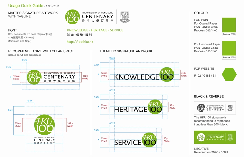
Always include a link to the Centenary website (http://100.hku.hk/) when placing the Centenary Signature on a web page. The lock-up artwork without shield may be used when the shield already appears on the page of the print collateral/website. * This is a "Quick Guide" only. We recommend that you refer to the Usage Guidelines whenever you develop marketing communications. |
|
All parties who wish to use the Centenary Logo in print, electronic media including websites as well as give-aways are invited to fill in the pro forma.
THE USE OF CENTENARY LOGO IN CONNECTION WITH TRADE, BUSINESS OR MERCHANDISE IS PROHIBITED.
For enquires and further information, please email: 100logo@hku.hk or call 2859 2791
THE USE OF CENTENARY LOGO IN CONNECTION WITH TRADE, BUSINESS OR MERCHANDISE IS PROHIBITED.
For enquires and further information, please email: 100logo@hku.hk or call 2859 2791

